


A graphic on COVID-19 results posted by a rural health unit of Sagada on Facebook recently caught the attention of some Filipinos for its “lively” design and the typeface used.
COVID-free Mountain Province
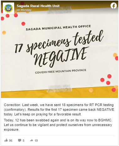
In a now-deleted Facebook post uploaded last Monday, Sagada Rural Health Unit announced the results of the administered COVID-19 swab tests.
It informed the public that 17 specimens of the real-time reverse transcription polymerase chain reaction (RT-PCR) test submitted for laboratory confirmation last week came back “negative.”
“Today, 12 has been swabbed again and is on its way now to BGHMC. Let us continue to be vigilant and protect ourselves from unnecessary exposure,” it added.
Mountain Province, the province which Sagada belongs to, has one confirmed COVID-19 case from the town of Besao as of June 16.
Meanwhile, the graphic accompanying the post caught the attention of some Filipinos who claimed that it gave them vibes of an “Antoinette Jadaone movie poster” or a rom-com movie like “To All the Boys I’ve Loved Before” because of its chic typeface and template.
The graphic was re-shared by Facebook user Carlo Avelino Araza Palulan and it eventually earned online buzz with more than 5,000 shares on the social networking site.
His Facebook friends were similarly amused by the graphic’s style.
“Kulang nalang sir ng ‘A film directed by Cathy Garcia-Molina’ HAHAHAHA,” an online user wrote.
“Palaban ang layout artist sorry hahahaah,” exclaimed another online user.
Palulan in the comments section also replied to a friend who told him that the typeface was “at least unique.”
“Parang gusto ay kikiligin ang buong lalawigan, jusme,” he commented, which gained laughing reactions.
Filipino rom-coms usually use a similar typeface and light colors in their promotional materials. Examples include movie posters of “English Only, Please” and “Walang Forever.”
The Official Poster of MMFF 2014 entry, English Only, PleaseStarring Derek Ramsay and Jennylyn Mercado Sama-sama po…
Posted by Jennylyn Mercado on Thursday, November 6, 2014
WALANG FOREVEROfficial Movie PosterQuantum Films #MMFF2015
Posted by National TV Ratings PH on Thursday, November 19, 2015
The Hospital Management Section of Capiz Province similarly gained online attention for some of its graphics which contained bright colors and an attention-grabbing typeface in spite of some sobering news.
STOP DENGUE BEFORE IT SPREADSAccording to the Department of Health Region VI, Western Visayas has recorded 3 Deaths…
Posted by Capiz Kabalaka HMS on Wednesday, June 3, 2020
However, it toned down the styles used when it informed the public about positive COVID-19 cases.
JUST IN!1 out of 10 repatriated OFWs who just arrived at the Roxas City Quarantine Facility tested POSITIVE in the…
Posted by Capiz Kabalaka HMS on Wednesday, May 20, 2020
CAPIZ COVID-19 BREAKING NEWS!As per DOH 6 statement today (May 20, 2020), 1 of our fellow Capizeños laboratory result…
Posted by Capiz Kabalaka HMS on Wednesday, May 20, 2020
The Sangguniang Kabataan of Barangay Lanot in Roxas City, Capiz, also released a graphic that eventually made its way to unofficial pages because of what some Filipinos called a “festive” look.
The SK reported that a repatriate from Tapaz, Capiz had tested positive of the COVID-19 as of June 14.
CAPIZ COVID-19 BREAKING NEWS!Today (June 14, 2020), the Department of Health Western Visayas announced that the first…
Posted by Sangguniang Kabataan Ng Brgy. Lanot on Sunday, June 14, 2020
The graphic announcement was not uploaded on the Facebook page of HMS Capiz.
However, it made its way to unofficial pages where Filipinos claimed that it appeared as if it was announcing a “fiesta” or a festivity because of the typeface and the bright colors used.
“Ba’t kasi parang pang fiesta yung font HAHAHAHHA,” a Facebook user wrote.
“Parang sobrang happy pa sila na meron sila kala mo nanalo sa lotto,” commented another online user.
“Ang jolly naman ng post nila haha,” wrote another Filipino.
Some also likened the graphics to the designs of variety shows segments of “Eat Bulaga,” “Juan for All All for Juan” and “Wowowin‘s” “Salamat Shopee.”
The graphics of both Sagada and Capiz were also shared on Twitter where some Filipinos wondered in jest if there were people who reviewed the look beforehand.
Help me with this guys. An accidental visual oxymoron? unintentional sarcastic imagery, or capricious paradoxical impression?
Also: graphic tragedy or comedy? pic.twitter.com/w4oEXDTEqz
— Dominic Ligot (@docligot) June 16, 2020
Some principles in graphics
Improvement Academy, a foreign team consisting of improvement scientists, patient safety experts and clinicians, released graphic principles that should be upheld in making public health information designs.
The team said that designers should “restrict” the color palette and “avoid overwhelming the viewer with many colors.”
It also urged them to “choose colors sensitively” in relation to the subject matter.
“It’s still important to choose colours that reflect the subject
matter where appropriate. Be aware that colour associations can be culturally specific so test colour appropriateness where you’re designing graphics for particular cultures,” the guide said.
The team added that designers must check that their imagery “is communicating clearly” since “excessive images or details can slow down comprehension and affect accuracy.”


